- Bandwidth
- Binary
- Browser
- Client
- Cookie
- CSS
- Domain Name
- Download
- Dynamic Site
- FTP
- Host
- HTML
- HTTP
- IP Number
- ISP
- Server
- Static Site
- Upload
- URL
- WWW
Thursday, December 20, 2012
Common Web Design Terms
Friday, December 14, 2012
Web Design?
Please visit the following site. Peruse the site and contribute.
The Exquisite Forest
Be sure to share your creations.
The Exquisite Forest
Be sure to share your creations.
Wednesday, December 12, 2012
Written Response
Please write a response the following question:
Is this course an art class?
Use the definition below, as well as the suggested structure below to help answer the question.
Definition of Art:
the expression or application of human creative skill and imagination,
typically in a visual form such as painting or sculpture, producing works to be
appreciated primarily for their beauty or emotional power
- Oxford English Dictionary
How to set up your response…
First Paragraph – Introduction
- An
opening statement
- What
is your position on the argument? Are you for or against the statement? (“What
do you think?”)
Second Paragraph – Defense
- Your
opinion and defense of your opinion through factual examples (“What examples support
your opinion?”)
Third Paragraph – Conclusion
-
Summarize your writing
-
What was your opinion? Why do you feel that way?
-
(“This is what I think and this is why I’m
right”)
Thursday, December 6, 2012
Thursday, November 29, 2012
Dreamweaver Tutorial 2
You will critique someone else's suggested tutorial. Someone else will critique yours. Please follow the tutorial to fully assess it.
Wednesday, November 28, 2012
Dreamweaver Tutorial
Please comment below, including your link to the tutorial. Remember you will be defending your tutorial to the class.
Monday, November 26, 2012
Please watch the following tutorial and then answer the question below on a separate paper and turn in.
Dreamweaver
Do you feel that the tutorial was helpful? Why?
Did the video seem too difficult? Why?
Would you recommend this video to a friend who was interested in learning Dreamweaver? Why?
Do you feel that the tutorial was helpful? Why?
Did the video seem too difficult? Why?
Would you recommend this video to a friend who was interested in learning Dreamweaver? Why?
Friday, November 16, 2012
Critique
Please make sure that your blog address is copied and pasted in a comment on the following post...
A Blog of Your Own
We will be looking at and discussing them at 7:35.
A Blog of Your Own
We will be looking at and discussing them at 7:35.
Thursday, November 15, 2012
Your Competition
Please find three websites that have a similar product or service. Make sure that your prices are competitive. Then create a "links" gadget listing the site and a post that proclaims your great prices.
Wednesday, November 14, 2012
Tuesday, November 13, 2012
New Post For Your Blog
You need a post and page the lists your services/products and their prices. You need a minimum of 10 items and each line item should include a price and a photo.
Friday, November 9, 2012
Security For Your Blog
Please make sure that your site is secure per the expectations of the school.
Go to "settings" > "privacy" > and change both options to "No"

A test...
... if you remembered to go to the blog to see what I was expected you to do, please stand up and say "Oh Captain My Captain" after you leave your name as a comment below.
Monday, November 5, 2012
A blog of your own...
in a comment below, paste a link to your blog.
Be sure your blog includes the following elements...
Be sure your blog includes the following elements...
1.
a mission statement page
2.
two side bar gadgets (including a links
gadget)
3.
three links
(including one to the class website http://webdesignwithwade.blogspot.com
4.
four posts
including…
a.
a video
b.
a photograph
c.
an illustration
d.
an animated .gif
Wednesday, October 10, 2012
What is a Line
A Line can be considered in two ways. The
linear marks made with a pen or a brush or the edge created when two shapes
meet. Horizontal lines are calm and quiet
Vertical
lines suggest more of a potential for movement. Diagonal
lines strongly suggest movement and give more of a feeling of vitality to a
picture. A line is a enormously useful and versatile graphic device that is made to function in both visual and verbal ways.
http://www.usask.ca/education/coursework/skaalid/theory/cgdt/line.htm
picture url
https://blogger.googleusercontent.com/img/b/R29vZ2xl/AVvXsEhnADoUnN5BLBAQu8l9MRlXECP6i613ez20VHltCLzxEOYJUoGXtdb5ZsBSGtYL3AvA5EjchTl6GIs53wJvV-8LSH84SDNO_VqNDyv2ZrPWAtm0DAh0g2RfOOhvlwkBbwjJe-Oz52kbbA/s320/Line.jpghttps://blogger.googleusercontent.com/img/b/R29vZ2xl/AVvXsEhnADoUnN5BLBAQu8l9MRlXECP6i613ez20VHltCLzxEOYJUoGXtdb5ZsBSGtYL3AvA5EjchTl6GIs53wJvV-8LSH84SDNO_VqNDyv2ZrPWAtm0DAh0g2RfOOhvlwkBbwjJe-Oz52kbbA/s320/Line.jpg
Color
Color is one of, if not the most important element of design. It is an
element that can stand alone as well as contribute to other elements and
principles of design. For example, color can be a factor in the principle contrast.
Colors may contrast and create a very unique design.

Color
is what usually makes or breaks a design. If the colors are dull and don’t
really go together, people aren’t going to stay to explore the site. However,
colors that make a brave enough statement to the eyes will be more visited and
more frequently used. All in all, color is a very important element in the
elements of design


Work Cited
http://weheartit.com/
Color
Color is the part of light that is reflected off of the objects we see. This is the most important element of design. Without color, it is very difficult to create contrast and emphasis. The only type of contrast that would be created would be that which is between black and white. Without color, all web sites would be black and white and many pictures wouldn't have the beauty that they do now because many pictures are focused on their colors such as this picture.

and this picture.

These pictures may look nice in black and white, but the blue adds an effect to the pictures that neither black or white can create.

http://i.neoseeker.com/mgv/156168-Stitch/168/24/stitch_drawing_4_color_display.png
and this picture.
These pictures may look nice in black and white, but the blue adds an effect to the pictures that neither black or white can create.
http://i.neoseeker.com/mgv/156168-Stitch/168/24/stitch_drawing_4_color_display.png
Form Antonio baratta
"Shape is the external outline of an object. It is two-dimensional.Form is a shape that is three-dimensional" as said by http://coolschool.k12.or.us/courses/115100/welcome/elements1.html. You can see form at its rawest in this picture.

The image is simple and still ketches a person's eye.
If not for form this picture would not be there. It is the simplest element and it is essential to art.
This web page had no form, there is no picture without form. Form is the foundation for a picture, while color is a third
Form by Haley Grant
"Form is the shape, visual appearance, or configuration of an object." http://en.wikipedia.org/wiki/Form
If we didn't use Form, no one would understand the shapes/structures/visual appearances of an object.
Line- Angela Catalano
Line is an element of design. A Line is a form with width and length, but no depth. Artists use Lines to create edges, the outlines of objects. A Line is created by the movement of the artist's pen. Lines can tell you what mood the artist is in. For example:
 "Horizontal Lines are calm and quiet,"
 "vertical Lines suggest more of a potential for movement,"
 "while diagonal Lines strongly suggest movement and give more of a feeling of vitality to a picture."
 "Lines used to follow the edge of forms are called contour drawings."

"Drawings which seem to depict more movement than actual outline are called gesture drawings."
"Horizontal Lines are calm and quiet," "vertical Lines suggest more of a potential for movement," "while diagonal Lines strongly suggest movement and give more of a feeling of vitality to a picture.""Lines used to follow the edge of forms are called contour drawings."
"Drawings which seem to depict more movement than actual outline are called gesture drawings."
So you should buy Line because: its awesome and you can do so many different things with Lines and you can create new things with Lines. You can basically do anything with it.
This was where I got my information from
Shape ~ Oliver
a square -------------->

this is an example of shape <(o.o<). Shape is an element of design, and is defined as :
~Something distinguished from its surroundings by its outline.
|
shapes make up EVERYTHING so to not use shapes in art is to not create any thing at all.
 And though we seem to think of all art like poor Mr. Square, shapes can blend together to create almost anything.
<-------------------------------
(www.art2arts.co.uk)
SO use shapes in your art otherwise your not doing anything at all, and your stuff will look bad a**
 And though we seem to think of all art like poor Mr. Square, shapes can blend together to create almost anything.
<-------------------------------
(www.art2arts.co.uk)
SO use shapes in your art otherwise your not doing anything at all, and your stuff will look bad a**

SHAPE! ~ Anastasia Zagurskaya
Shape is an area that stands out due to the boundary that surrounds it, change in color, value, or texture. Do not confuse shape with a form! They do share some similarities, but essentially they have different meanings. Form is a 3-dimensional figure, whereas shape is 2-dimensional or flat.
Shape is pretty much an essential component of art, without it artwork wouldn't be complete.
SHAPE:


FORM:

Sources:
http://arthistory.about.com/cs/glossaries/g/f_form.htm
http://www.studiocodex.com/shape01.html
http://tobyblair.wordpress.com/about/
Shape is pretty much an essential component of art, without it artwork wouldn't be complete.
SHAPE:


FORM:
Sources:
http://arthistory.about.com/cs/glossaries/g/f_form.htm
http://www.studiocodex.com/shape01.html
http://tobyblair.wordpress.com/about/
What is Space
Space is concerned
with the area the design will take place on. http://en.wikipedia.org/wiki/Design_elements_and_principles


You are probably wondering what's so special space. Well it can be either negative or positive. Positive space is filled with objects and elements and negative space opens the space between objects and elements. They can create an illusion of space with linear perspective, size, vertical location, overlapping, and detail.
Space. Isn't It Great?
Space, isn't it great? "Negative space, also known as white space, can be loosely defined as the area of a page not occupied by content. More appropriately, it is the space between specific items on the page. Negative space does not have to be white, or even solid in color. It can contain gradients, patterns or background objects (http://sixrevisions.com)." Space is everywhere, that is why it's so cool.

 http://www.cranearts.com/wordpress/wp-content/uploads/2011/07/white-space2.jpg
http://www.accidentalcreative.com/wp-content/uploads/2011/09/whitespace-450x300.jpg
http://www.cranearts.com/wordpress/wp-content/uploads/2011/07/white-space2.jpghttp://www.accidentalcreative.com/wp-content/uploads/2011/09/whitespace-450x300.jpg
Nick Antici TEXTURE!!
Texture is the surface quality that can be seen and felt, here's an example

of the surface's texture. Texture is the best element of design because there are many different types of texture. Like these


There are many other textures these are just two examples. A texture can range anywhere from a smooth polished mirror to to the roughest mountain range as seen by airplane.
http://freestocktextures.com/texture/category/5
http://new.4-hcurriculum.org/projects/kidspace/E-P.htm
http://daphne.palomar.edu/design/texture.html
Value
Value is used to describe the lightness or darkness of a given area. For example


Value is the best Element of Design because of the different things it can be used for.
. 
Drawing by Marguerite Smith
Value can create emphasis. Using various values, a focal point will be established. Having something light on a dark background or something dark on a light background will create emphasis.
Gradation of value can also be used to give a sense of depth. Light and dark areas can give the impression of being three dimensional.
Value is the best Element of Design because of the different things it can be used for.
This is where I got my information from.
Value - Blake Dahlmeyer
Value is the lightness or darkness of a color.
It is the most valuable and crucial element because it dictates the colors of an image which dictates the mood. Color is vital in images; consequently, contrast and the range of contrast between light and dark is vital to the image's effect. A broad range of value is more striking and profound than a limited range of value which is more dull or hazy. For instance, the first image below has a strong range of value. The bright yellowish green is made even more potent when put against the black of the shadows. However, the second image has an opposite effect because its limited range of value. The color scheme established by a small range of value adds to the image's dreamy, hazy effect.


Balance
Example 1: A large shape close to the center can be balanced by a small shape close to the edge
Example 2: A large light-toned shape will be balanced by a small dark-toned shape
Example 3: Balance in shapes, value, and position
Example 3: Balance in shapes, value, and position

http://upload.wikimedia.org/wikipedia/commons/thumb/e/e0/Clouds_over_the_Atlantic_Ocean.jpg/275px-Clouds_over_the_Atlantic_Ocean.jpg
This picture displays balance
because the large area of dark blue space (the ocean) is countered by the light
spaces of clouds and the lighter blue sky. The dark space is also all on the
bottom, so the white space on the top balances this picture.

https://blogger.googleusercontent.com/img/b/R29vZ2xl/AVvXsEjx86qEdmCtZ3lCswolZODkAgEShD2czJF4i0DVdcWdprKkhaD3EUP-KHekjlewmZOLEWvfX7EvCQPlAn-3wfJg786XtxnBiupUsRt5CpohlZnr2sGQURIZwLawUS1-CMXNrgJB_dOI6Q/s1600/ocean_water_orca_22541_l.jpg
This picture displays balance
because there is darker blue ocean water on the bottom, and the a light wave of
pale blue, and a very light background of mountains and sky.

http://www.7easylife.info/wp-content/uploads/2010/04/Colorfuljellyfishverywonderful1.jpg
This picture displays balance because the entire background is black, while there is the light jellyfish. The distribution of visible light is also apparent in the specs of blue breaking up the darkness.
Balance is significant and important to use because it gives a more pleasing appeal to a piece of art, or a web design. Balance allows the viewer to see the piece of work evenly, rather than being drawn to only one side, or one element.
Emphasis

For example, this picture shows a group of people holding hands. The emphasis is easily seen on the chests of the stick people. All of them but one have checks on them and the one has an X. The creator could be trying to show emphasis on that person for being a different type of person or in some way different from the others.


In this picture from a beach the first thing your eye is drawn to is the bent tree right in the middle. The person that took this picture definitely wanted anybody looking at this picture to clearly see the bent tree. He wanted the whole picture to clearly represent this abnormality of the tree.
-->

Emphasis
is Special forcefulness of expression that gives importance to something
singled and i got it from this website.

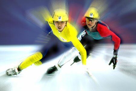
Movement! You gotta love it! (Pamela Cruz)
Movement is a principle of design
that gives an image or illustration life. It also has a certain flow to it that
makes it look nice. You can also define it like this, courtesy of Dictionary.com : [an] abundance of events or incidents
It's pretty much the best principle out there because it makes your images interesting. You know ANYONE who likes to look up or see pictures of lame, non-moving fruits in a bowl no matter how classic? Yeah, I didn't think so either. Sure, you still need your Balance and Emphasis and all, but I'm telling you, this is what makes people stare at their computer or mobile phone screen for hours on end as they stare in sheer ecstasy your work. When you add the illusion of movement or include several events in a photo that make it flow from left to right or top to bottom or whatever to whichever, you'll get admiration from many people. The following images show this off perfectly.


It's pretty much the best principle out there because it makes your images interesting. You know ANYONE who likes to look up or see pictures of lame, non-moving fruits in a bowl no matter how classic? Yeah, I didn't think so either. Sure, you still need your Balance and Emphasis and all, but I'm telling you, this is what makes people stare at their computer or mobile phone screen for hours on end as they stare in sheer ecstasy your work. When you add the illusion of movement or include several events in a photo that make it flow from left to right or top to bottom or whatever to whichever, you'll get admiration from many people. The following images show this off perfectly.
This principle also can make you
feel like you can imagine the image moving or it may even look like it really
is moving.
Oh, and if you want to see where
the pictures came from, visit these sources.
Not sure why since you can just
copy and paste these photos or hit the "Save as" button, but then again,
LEGALITIES. They're always on our backs....
Scale is the best principal
Scale is the best principal of design. Scale is the relationship between the sizes of the elements. So without it there would be no pictures. They would be out of size you wouldn't be able to judge there depth either.
 Now look at this picture of this patheon. Notice how you can tell how this structure is tall. Compared to the trees in the background all small. This picture is amazing. Now look at this horrible picture with no scale from Finland.
 There is no scale in this photo you have no depth perception which makes this picture so much more boring to look at than the first picture that is amazing. So as you you can see scale is the best principal of design because without the picture is boring to look at, you can't judge it's depth and it's confusing to look at. Now this is the best picture ever and is great for scale is this adorable little guy...
