Wednesday, October 10, 2012

Movement! You gotta love it! (Pamela Cruz)

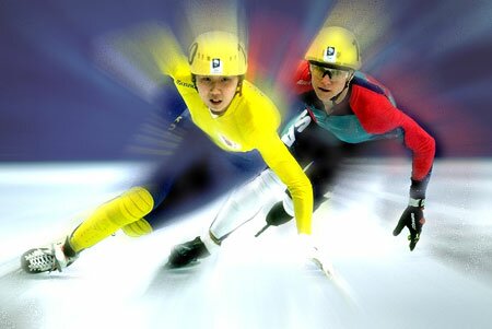
 Movement is a principle of design that gives an image or illustration life. It also has a certain flow to it that makes it look nice. You can also define it like this, courtesy of Dictionary.com : [an] abundance of events or incidents

It's pretty much the best principle out there because it makes your images interesting. You know ANYONE who likes to look up or see pictures of lame, non-moving fruits in a bowl no matter how classic? Yeah, I didn't think so either. Sure, you still need your Balance and Emphasis and all, but I'm telling you, this is what makes people stare at their computer or mobile phone screen for hours on end as they stare in sheer ecstasy your work. When you add the illusion of movement or include several events in a photo that make it flow from left to right or top to bottom or whatever to whichever, you'll get admiration from many people. The following images show this off perfectly.


stock photo : Zooming out on out-of-focus Christmas lights to give it a feeling of movement and motion


This principle also can make you feel like you can imagine the image moving or it may even look like it really is moving.

Oh, and if you want to see where the pictures came from, visit these sources. 


Not sure why since you can just copy and paste these photos or hit the "Save as" button, but then again, LEGALITIES. They're always on our backs....

Scale is the best principal

Scale is the best principal of design. Scale is the relationship between the sizes of the elements. So without it there would be no pictures. They would be out of size you wouldn't be able to judge there depth either.
Now look at this picture of this patheon. Notice how you can tell how this structure is tall. Compared to the trees in the background all small. This picture is amazing. Now look at this horrible picture with no scale from Finland.

There is no scale in this photo you have no depth perception which makes this picture so much more boring to look at than the first picture that is amazing. So as you you can see scale is the best principal of design because without the picture is boring to look at, you can't judge it's depth and it's confusing to look at.  Now this is the best picture ever and is great for scale is this adorable little guy...

Tuesday, October 9, 2012

Blake Dahlmeyer

My name is Blake. I love music, art, and playing guitar. George Benson is insanely amazing. Learning is actually interesting to me. Puppies are nice too but they smell weird. I'm naturally really laid back but I care deeply about the things that are important to me. Many people think I do drugs or something...but I definitely don't so yeah. Just sayin

Friday, October 5, 2012

AN EXPLANATION OF SCHOOL

Every Day is a Little Better

Head over here for more jokes, fails, and other strange and wonderful things here -> School of Fail

Pam wrote this~

Monday, October 1, 2012

Files Formats

Find out what the following acronyms stand for and what they are best used for...

.JPG

.GIF

.PNG

.EPS

.BMP

.TIFF

Please hand write the answers and turn them in to me by the end of class today.

Alexis

Hey, I'm Alexis. I went to Hayestown Elementay School, and that's where I met my best friend, Haley. I love to hang with all of my friends and be with family. I have a pretty torn family, but they're still great. Never in a million years would have I ever thought I'd be here right now. In DHS, in Danbury, with amazing people and opportunities within my reach. I'm in Key Club this year and can't wait. I'm so ecstatic to start my hopefully amazing high school years. :)